Shopstock v2
Description
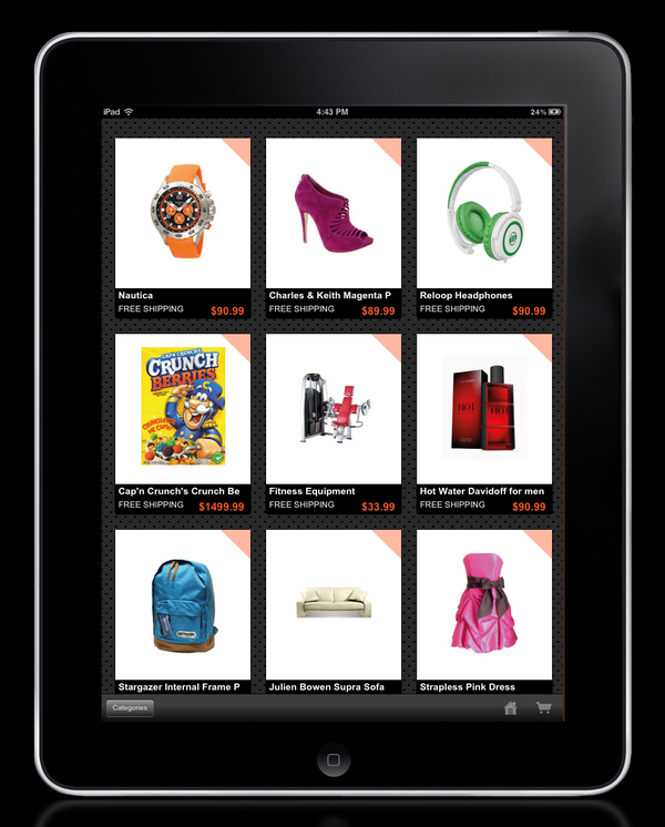
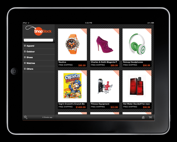
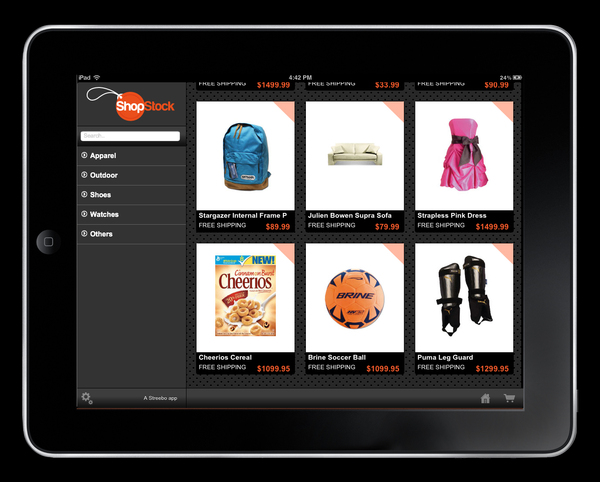
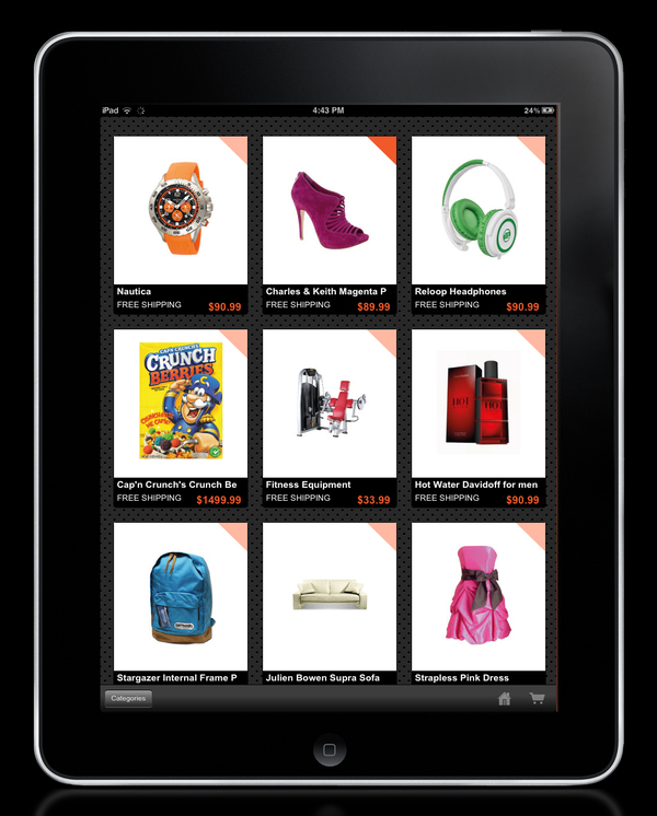
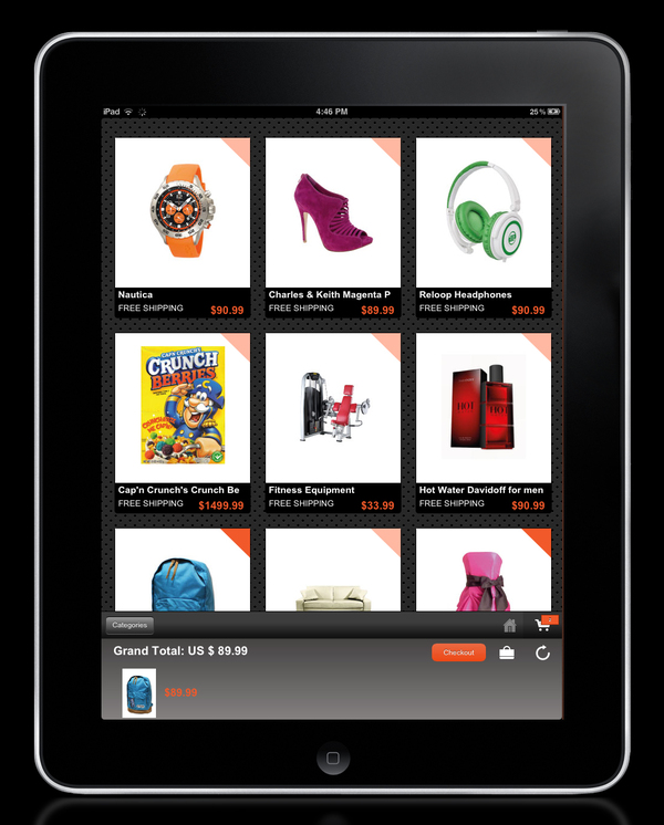
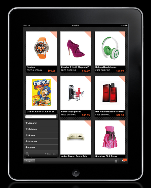
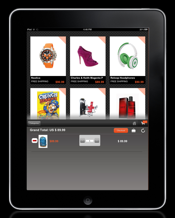
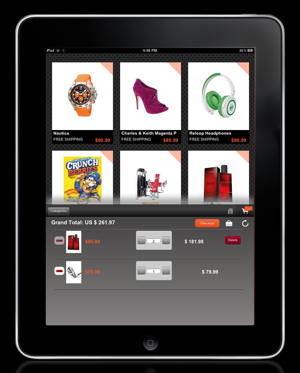
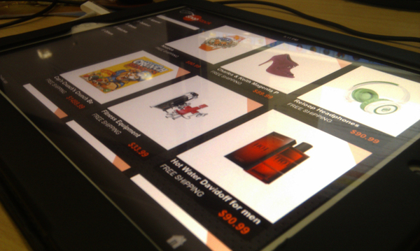
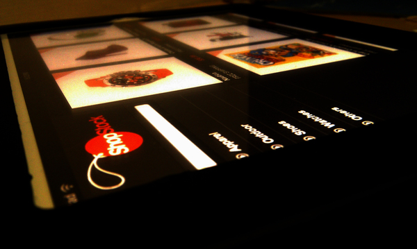
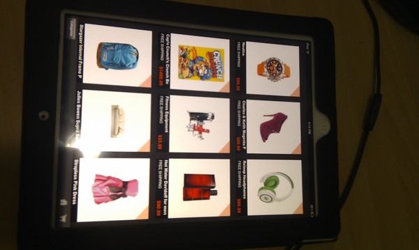
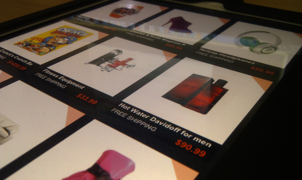
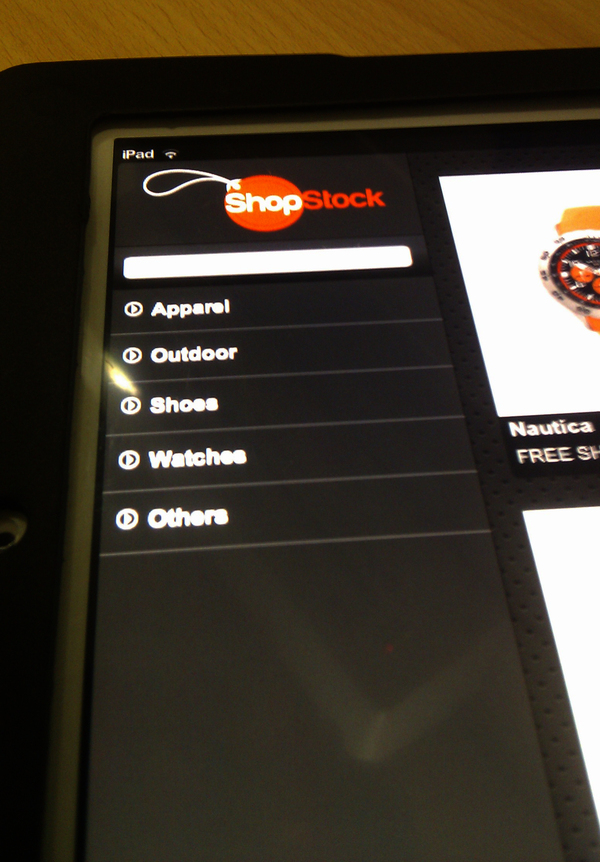
I recently did the remock for shopstock with a darker design and new interactive features making more use of the Ipad touch features. Here are some of the mockups/screenshots.
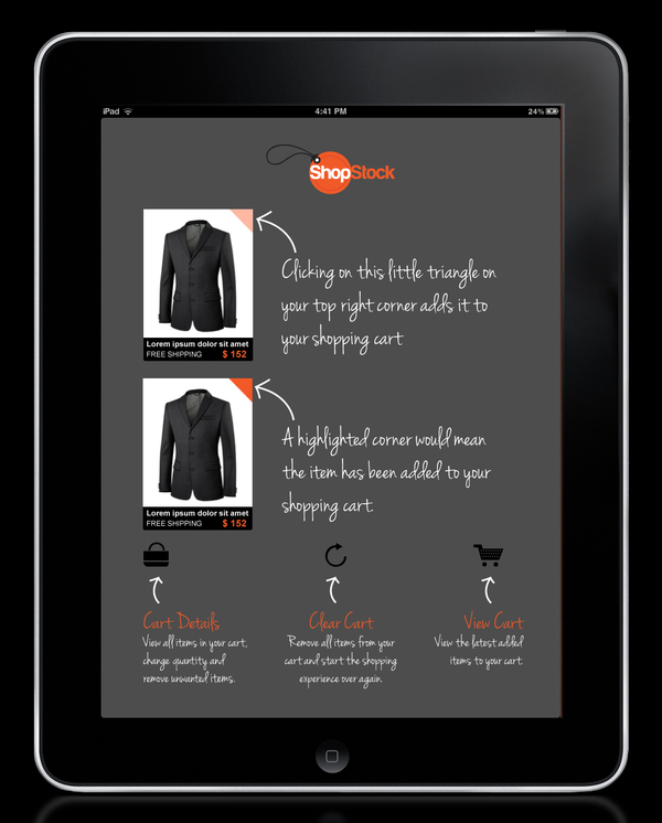
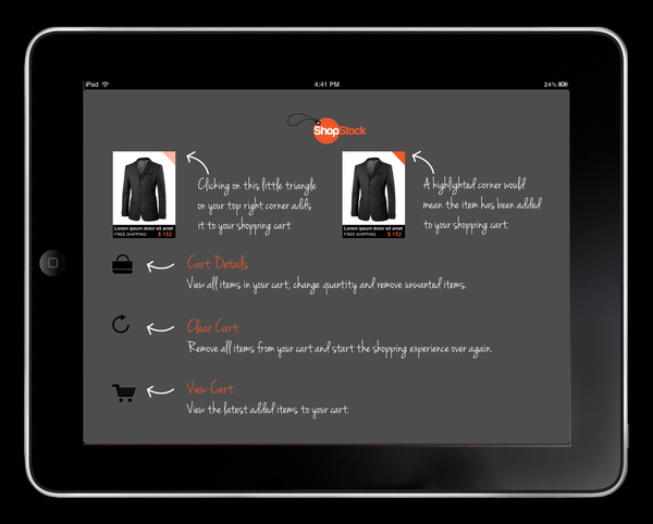
As this new design had some user experience that might needed some learning and getting used to, the app shows a help screen on start to explain how things are done.
This help screen can then be swiped away and brought back again with swipe. What it explains, amongst other things, is the adding to cart procedure, which can be done by tapping on the corner of an item which adds it instantly to cart. Although it is very intuitive and user centered, to make sure out users were not missing out on something, we decided to show how things were done.
This was done during my employment at Streebo Inc.
Client
Streebo Inc.
